
Tableau is a powerful tool that allows users to transform raw data into engaging reports and dashboards. However, the true power of Tableau does only lie in the data itself but also the quality of its delivery – this is where formatting comes into play.
Creating interactive and engaging visuals goes beyond just dragging and dropping elements onto the canvas – the quality of your dashboard formatting can also make all the difference to help communicate your data insights.
In this article, I will walk you through the art of formatting in Tableau, exploring various tools and techniques that can help you take your visualization skill to a whole new level.
Let’s get started.
The Importance of Formatting in Tableau
In data visualization, formatting plays an important role to enrich your dashboards. A well-formatted dashboard not only makes your data more understandable but as well gives your work a professional outlook.
Imagine presenting a dashboard with inconsistent fonts, cluttered layouts, and inordinate colors – it would only sabotage the credibility of your data and throw your audience in the dark.
Thus, proper formatting allows you to highlight the most important part of your work, help the audience understand better, and create attractive designs that enhance the overall user experience.
Now, let’s explore the formatting techniques in Tableau – from basic to advanced.
Basic Formatting Techniques in Tableau – Fonts, Colors, Tooltips, Lines, and Backgrounds
In Tableau, the basic formatting options such as fonts, colors, and backgrounds might seem simple, but they have significant impacts on the readability of your dashboards. Let’s go through some of them:
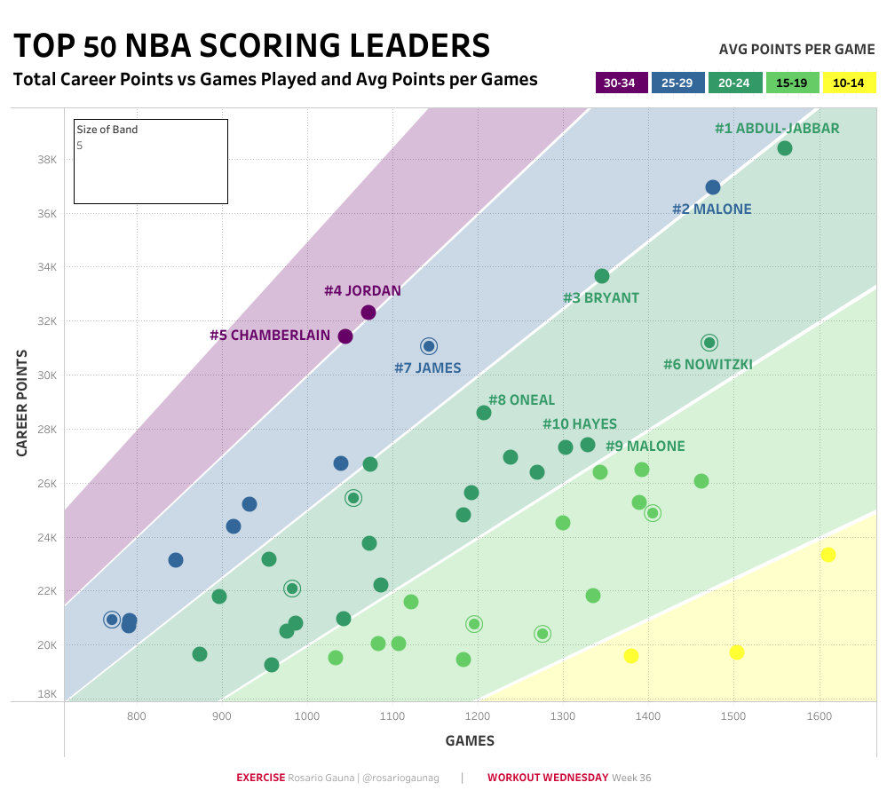
1. Color Coding
Using color coding is an effective way to highlight specific data points in your visuals to help users easily identify data trends and patterns.
You can use color coding in bar charts, line charts, scatter plots, pie charts, and maps to highlight specific values or categories.
Below is an example of color coding in a scatter plot.
2. Fonts
Formatting your fonts can also enhance the readability and art of your visuals. Tableau provides options to adjust font sizes, styles, and colors.
Where to use: Use font formatting in titles, axis labels, and data labels to make them stand out or match the theme of your dashboard.
Below is an example.
3. Data Labels and Tooltips
Data labels show the actual data values on top of the data points in a visualization, and tooltips help to provide extra information when you hover over the data points.
You can use data labels in bar charts, line charts, and pie charts, while Tooltips work well in scatter plots and maps to provide details about each data point.
Below is a dashboard using both labels and tooltips
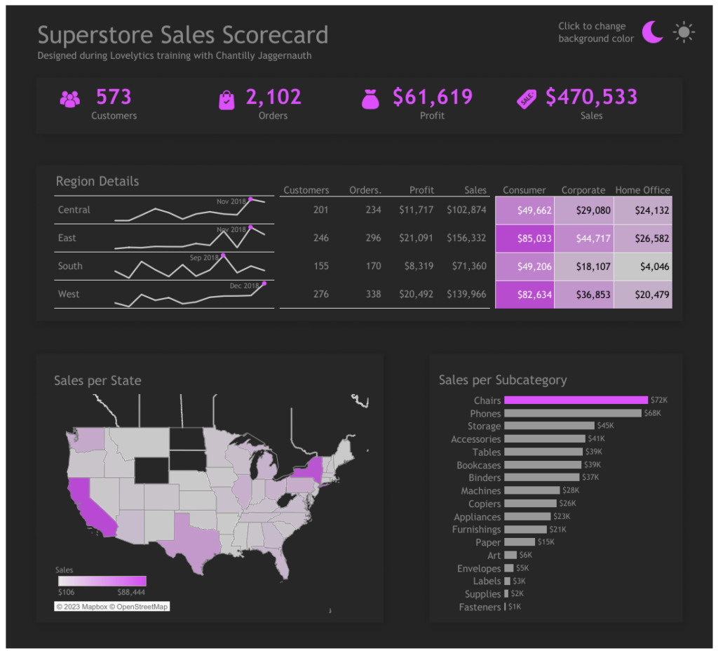
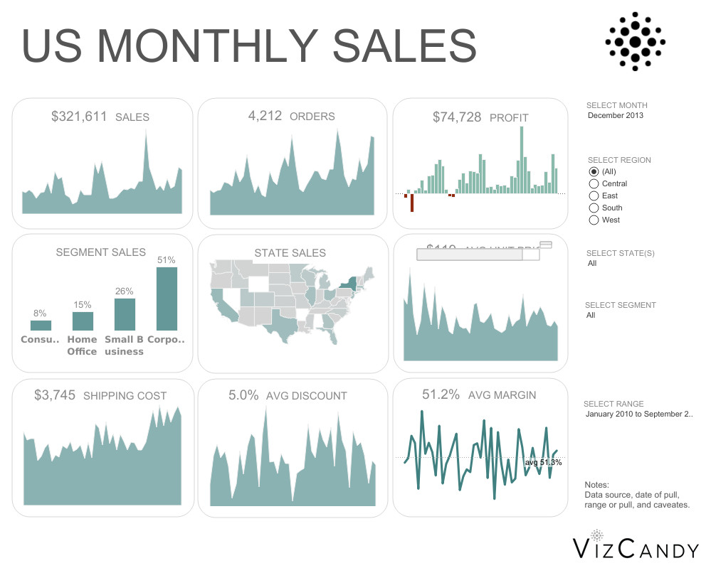
4. Borders and Lines
In visualization, adding borders and lines can help separate various parts in your dashboard, to keep a more organized and structured look.
You can use borders to create boundaries in your dashboards and use lines to connect data points or draw attention to some parts of the visual.
Check this sales performance dashboard to see how borders and lines were used
5. Backgrounds and Images
Background colors and images can be used to set the theme of your dashboard to make it more visually appealing.
It’s mostly used to complement the data and enhance the aesthetics of the dashboard.
Advanced Formatting Techniques in Tableau
Now that we have explored some basic formatting techniques in Tableau, let us go through some advanced formatting techniques to customize your visuals.
Here are five advanced formatting techniques, how and where to use them, and practical examples:
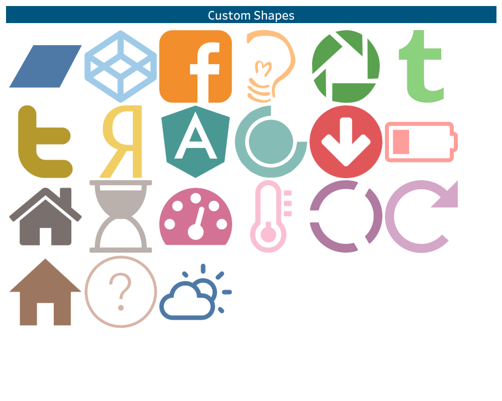
1. Custom Shapes:
Tableau provides the option to use custom shapes over the in-built shapes for data points. With this, you can import your own images or make use of the built-in shapes in Tableau library.
You can use these custom shapes can be used in scatter plots, maps, and other visuals where data points represent specific objects.
Below is an example of custom shapes in Tableau
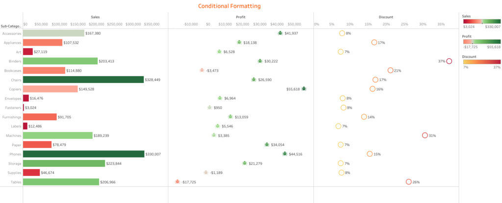
2. Conditional Formatting:
Conditional formatting allows you to change the formatting of your data based on certain conditions or rules. You can define formatting rules for colors, sizes, and other features.
it is often used in heat maps, diverging bar charts, and data tables to highlight important data points or outliers.
Below is an example of conditional formatting
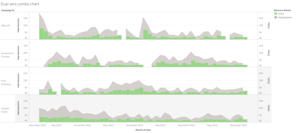
3. Dual Axes and Combo Charts
While dual axes allow you to plot two measures with different scales on the same chart, combo charts combine different chart types, such as bars and lines, in a single visual.
Below is an example of a dashboard using dual axis
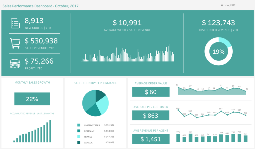
4. Dashboard Layouts:
Tableau offers the flexibility to arrange and organize multiple visuals in a dashboard, and this is where you use layouts. These layouts are crucial when combining multiple visuals and creating combined insights.
Here is an example of how to use layouts in a dashboard
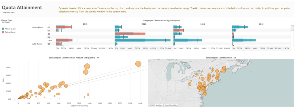
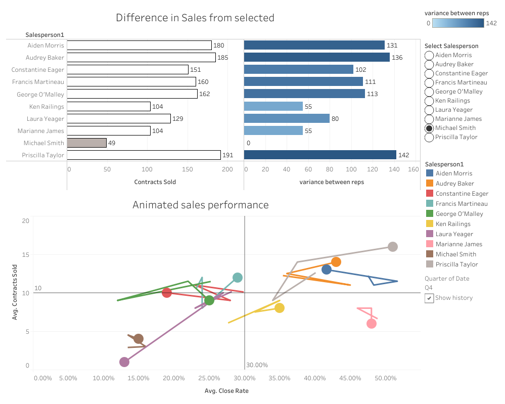
5. Animations and Interactivity:
Tableau also allows users to add animations and interactive elements to their visualizations. While animations show the change in data over time, interactivity allows users to explore and filter the data.
Check out this dashboard to see its interactivity.
Best Practices for Formatting in Tableau
To ensure that your Tableau formatting yields the best results, it is important to follow some best practices. To start with, always put your audience in mind – understand their needs, consider their level of expertise, and format your data accordingly.
Furthermore, consistency is key. Always maintain consistent formatting styles – fonts, colors, images and backgrounds, layouts, etc.
Finally, formatting is not a one-size-fits-all approach. So, you must always test and re-test. You can play around with different styles, ask for feedback from colleagues, and make adjustments as needed.
Conclusion – The Power of Formatting in Tableau for Impactful Insights
In conclusion, formatting in Tableau is powerful for enhancing your data visualizations and dashboards and communicating meaningful insights.
From basic to advanced techniques, Tableau offers a wide range of tools to help you create clear visuals, and by leveraging these techniques you can create engaging and interactive dashboards and visualizations.
Thank you for reading!