Are you looking for better ways to identify key trends and patterns in your reports? Do you want to highlight threshold values in your charts? Then you may have to try out drawing a line on your Power BI chart.
In Power BI, users can create insightful charts and reports by drawing threshold lines in their charts based on specific values in the dataset.
In this article, I will talk you through the steps to add threshold lines to your visuals, exploring Clustered Column Charts, Clustered Bar Charts, and Line Charts.
Let’s get started.
Requirements: Power BI Line Chart
Before we get started, make sure you have:
- installed Power BI Desktop
- a dataset including a threshold value
Understanding Threshold Values in Datasets
Before I explore how to draw a Power BI line chart using threshold values, let me walk you through what threshold values are in datasets. Threshold values are specific points or ranges in your data.
These values are often used to set benchmarks, and goals, or to identify important points or boundaries. By visualizing thresholds on your charts, you can quickly identify data trends, patterns, and outliers for better decision-making.
Now that you understand what threshold values are, let me explain why you need to draw lines on your charts using threshold values.
Drawing lines on charts using threshold values is effective to highlight important data points and trends and for easy visual reference for data interpretation. This is very helpful when communicating key data insights.
Now, let’s go through how to draw lines on Power BI charts using threshold values.
Drawing a Power BI Line Chart — A Step-by-step Guide
Below is a step-by-step guide on how to draw a line in a Power BI chart using a Clustered Column Chart, Stacked Column Chart, and Line Chart.
Let’s go!
Step 1: Load Data and Create a Chart
The first step is to open your Power BI Desktop and import your data, and drag and drop the required fields into the “Values” section in the “Visualizations” pane.
For this article, I will make use of the IMDB Movie Dataset. You can download the data here.
Step 2: Create a New Column for Threshold Value
You may need to add a threshold value column if your dataset does not have one. Below are the steps:
- Select your chart
- Click on the “Modelling” tab
- Then click on “New Column”
- In the formula bar, enter the DAX formula to create a threshold value column, e.g., you can use
Threshold = 50(change 50 to your threshold value).
Step 3: Add Threshold Line to the Chart
Now that we are done with that, let’s move to the next step, which is adding the threshold line to each chart type.
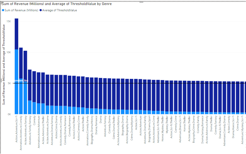
1. Clustered Bar Chart
- To add a threshold line to your Clustered Bar Chart, click on the visualization, and drag the field you want to use for the column chart into the “Axis” section in the “Visualization” pane including the
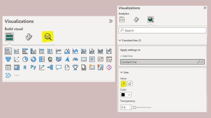
Thresholdcolumn. - After that, select the visualization and click on the “Add Further Analysis to Your Visual” button in the “Visualization” pane and click on “constant line”

Under “Constant Line”, click on the “fx” button (this will open a new window).

Here, you will select your ThresholdValue as “What field should we base this on?” and set your “Summarization” format. Then press “OK”.
PS: You can change the color and customize the line using different formatting options under the “Constant Line” pane.
(Here is what mine looks like after formatting)

2. Stacked Column Chart
Adding a threshold line to the Stacked Column Chart, create a Stacked Column Chart, and click on the visualization. Then drag the required columns into the “Axis” and “Values” sections including the ThresholdValue column.
After that, select the visualization and click on the “Add Further Analysis to Your Visual” button in the “Visualization” pane and click on “Constant Line.”
Under “Constant Line”, click on the “fx” button (this will open a new window).

Here, you will select your ThresholdValue as “What field should we base this on?” and set your “Summarization” format. Then press “OK”.
Don’t forget to format your line as you like.
(Here is mine after formatting)
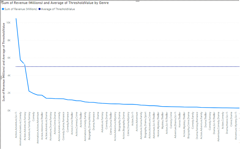
3. Line Chart
Using a Line Chart is similar to the above. Create a “Line Chart” visualization by dragging and dropping the field you want to visualize, including the ThresholdValue
Just follow the above steps and format your line as you like.
(Here is mine after formatting)
Congratulations! You have successfully drawn lines on your Power BI chart using threshold values from your dataset.
Now, let’s explore how you can customize these lines to suit your specific needs.
Techniques for Customizing a Power BI Line Chart
Power BI offers several customization options to customize your lines. Through this, you can create engaging and interactive charts. The following are some techniques for customizing lines on Power BI charts:
1. Change line styles
In Power BI, you can choose any line style: solid, dashed, or dotted. Try out anyone and go for the one that best fits your data or simplifies your chart design.
2. Add labels to lines
For additional context, you can also add labels to your lines. These labels make it easy to show your threshold value. Also, don’t forget to format the label to make it readable and engaging.
3. Adjust the thickness
Depending on your preference, you can adjust the thickness of the lines. Generally, thicker lines draw more attention, unlike thinner lines which blend with the chart.
4. Change line colors
Also, Power BI allows you to choose from different colors for your lines. Just select visually appealing colors that align with your color scheme for consistency.
5. Use conditional formatting
Finally, to make your lines even more dynamic, you can use conditional formatting. You can, for instance, change the style of a line based on whether the data is above or below a certain threshold. This helps to highlight key trends and patterns.
Conclusion and Summary: Power BI Line Chart
In this article, I have explored a guide to drawing lines on Power BI charts and customization tips that can help you enhance your visualization.
Key takeaways from this article:
- Threshold values are specific points or ranges in your data
- Drawing lines on charts using threshold values helps highlight crucial data points and trends
- Always customize your line by changing line colors and styles, adding labels, adjusting line thickness, and using conditional formatting.
I hope you enjoyed reading this article. You can also check out how to Build a Waterfall Forecast Chart in Power BI.
Thanks for reading!