If you are looking to take your Tableau skills to the next level then you need to learn the art of using filters on your dashboard. This allows you to better analyze data, improve user experience, and uncover valuable data insights.
In this article, I will explore the process of creating filters in Tableau, common types, and how to use them to create dynamic dashboards and visualizations in Tableau.
Let’s get started!
Why are Filters Important in Tableau?
Tableau filters play a crucial role in creating dynamic dashboards, allowing users to explore and uncover potential data insights. Using filters, users can drill down into specific data points, compare multiple scenarios, and so on.
Filters help to declutter and focus on the relevant details, which makes the dashboard more intuitive and readable. Also, filters contribute to the performance optimization of reports and dashboards by reducing the amount of data being processed and displayed.
In summary, filters in Tableau are the key to unlocking the full potential of your data and to building quality and dynamic reports and dashboards.
Different Types of Tableau Filters
Tableau offers various filters to cover different data scenarios and visualization requirements. Let’s explore some filter types used in Tableau:
1. Dimension Filters
Dimension filters in Tableau let you filter your data based on certain values or categories. Examples of dimension filters include:
- Single Value: This filter allows you to select a single value from a dimension to include or exclude in the view.
- Multiple Values: With this filter, you can select multiple values from a dimension, either by manually selecting them or by using a search option.
- Top/Bottom: This filter allows you to display the top or bottom values in a dimension based on a specified number or percentage.
2. Measure Filters
Measure filters are used to filter numerical data values such as sales, profit, quantities, etc. They are very useful when focusing on specific ranges or outliers in your data. Examples of measure filters include:
- Values Range: This filter option lets you define the range of values for a measure. For instance, filtering sales between a specified min and max value.
- Conditional Filters: These filters allow you to filter data on specific conditions, such as filtering products with sales above a certain threshold.
- Top/Bottom: Similar to dimension filters, you can as well use the top/bottom filter for measures to display the highest or lowest values.
3. Quick Filters
Quick filters provide a friendly interface and let users make quick and interactive alter filter settings, making data interaction easy. They are often added to the canvas as drop-down lists or sliders for simple data exploration.
4. Data Source Filters
These filters are applied while losing data into Tableau, allowing you to filter your data before importing it into Tableau. Data source filters can help improve data performance as they can help you reduce the quantity of data being processed.
How to Add Filters in Tableau Dashboards
To add filters to your dashboard in Tableau, follow these steps:
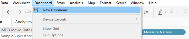
1. Create a Dashboard
The first thing is to create a dashboard. Just select “New Dashboard” on the home page.
2: Navigate the “Show Me” Pane
You will see the “Show me” pane on the right-hand side of the canvas. Click on it, to open the different visualization options. Then choose the visualization that best suits your analysis.
3. Drag and Drop the Fields
You can simply drag your Dimensions or Measures into the filter shelf beside the Tableau canvas.
4. Configure the Filter
To configure the filter, right-click the canvas and select “filter” to open a menu with different options to configure the filter.
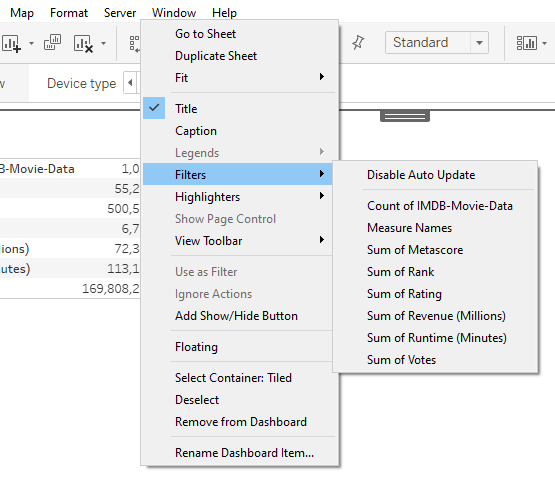
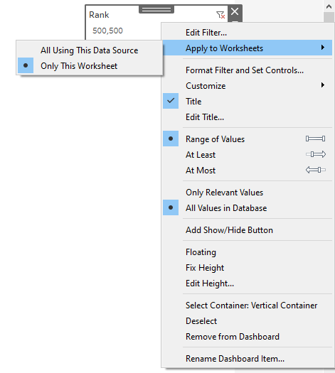
5. Apply the Filter to your Worksheet
Now that you have created your filter, the next thing is to apply it to your worksheet. To do that, right-click the filter component and select “Apply to Worksheets.”
In the dialog box, choose how and where you want the filter to be applied in the worksheet.
Best Practices for Creating Effective Tableau Filters
Creating effective Tableau filters goes beyond just dragging and dropping filters into your dashboards, you should consider the following practices to make the most out of your filters and improve the user experience:
1. Keep it Simple
Avoid cluttering your dashboards with too many filters. Instead, focus on the essential filters that provide the most value to the users. A clutter-free dashboard improves usability and prevents overwhelming users with too many options.
2. Provide Context
Add clear and concise filter titles and descriptions that provide context to the users. This helps users understand the purpose of the filter and how it affects the displayed data. Contextual information makes the dashboard more intuitive and user-friendly.
3. Use Hierarchical Filtering
If your data has multiple hierarchies, then consider using hierarchical filtering. This lets you navigate through different levels of data, drilling down from high-level summaries to detailed information. Hierarchical filtering provides a structured approach to data exploration.
4. Enable Multiple Selections
Always allow users to be able to select multiple values within the filter. This gives users the flexibility to compare and analyze numerous data subsets concurrently. This also enhances the interactivity and versatility of your dashboard.
5. Make use of Data Blending
In cases where you need to combine data from multiple sources, make use of Tableau’s data blending functions. By blending data, you can create filters that cut across different data sources, giving you a combined view of your data.
Conclusion: Tableau Filters on Dashboard
Creating effective Tableau filters is vital to creating engaging and interactive dashboards that deliver meaningful in
By understanding the different types of filters, implementing best practices, and employing advanced techniques, you can optimize your filters for maximum impact.
Remember, to create an effective dashboard in Tableau, keep the filters simple, and always provide context to help users gain valuable insights. Finally, don’t forget to optimize your filters to give your dashboard an interactive experience.
If you enjoyed reading this, you may also want to read about Power BI slicers and how to use them.
Happy visualizing!