
Power BI is a powerful business analytics tool that enables users to create visualizations, reports, and dashboards using various data sources, and one of its core features is the ability to create a custom map to visualize data on a geographic level.
This affords users the opportunity to display data in a way that is visually appealing and easy to understand. As a result, users can choose their preferred map, add data to it, and customize the visualization to match their specific needs.
Whether you are a beginner or an expert, you can easily design and style your data-rich maps in just a few steps – no technical skills are required!
Find out how right here.
Prepare your data
Before creating a custom map in Power BI, you need to have data that includes geographic information. This information can be in the form of longitude and latitude coordinates or region/country names.
Also, if your data does not contain geographic information, you can use tools like geocoding to assign location data to your data set and make sure your data is in a format that can be easily imported into Power BI.
Connect Your Data to Power BI
After preparing your data, the next thing to do is to connect your data. You can do this by clicking the Get Data tab and selecting the type of data you are importing using the right source (e.g., Excel file, SQL database).
Follow the prompts to connect to your data and import it into Power BI, and click Connect. Once connected, Power BI will generate a scoped view of your data so you can get started with your mapping project.
Select Map Visualization in Power BI
Once you have connected your data, it is time to select a map visualization in Power BI. To do this, go to the Visualizations pane on the right-hand side of your dashboard, and select either Filled Map or Shape Map from the list.
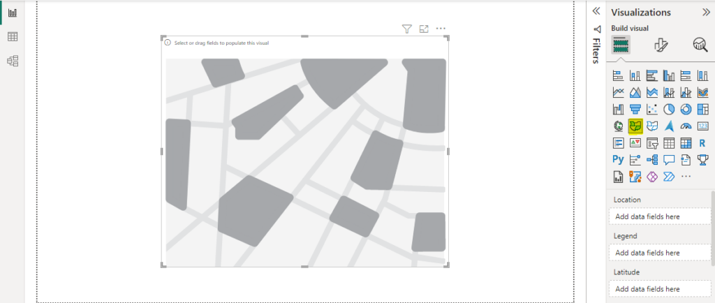
From the Fields pane, drag and drop the geographic data you want to visualize onto the Location field well in the map visual.
Customize the Map by Adding Custom Locations and Pinpoints
Once your data is added to the map visual, you can customize the map to meet your needs. You can change the map type, add labels or titles, and adjust the zoom level. You can also add other visuals to the report canvas to provide additional context for the map.
Furthermore, you can add custom locations to the map to make it more tailored to the data you are looking to visualize. Also, you can add locations based on latitude and longitude coordinates for pinpoint accuracy.
Finally, you can use various customization options such as themes, colors, labels, and tooltips to tailor the customize your map to meet your specific needs
Add Layers to the Map
If you have multiple maps displayed on the same dashboard, you can use either single-layer or multi-layer mapping techniques.
Single-layer mapping involves using a single base map and adding different data sets to it in separate layers. This is useful for comparing data sets or concentrating on a specific area of interest.
On the other hand, multi-layer mapping lets you combine data sets from various sources into one chart, as well as customize the look and feel of multiple base maps on the same dashboard.
FAQs: How to Create a Custom Map in Power BI like a Pro
How can you share your custom map with others?
To share your custom map with others in Power BI, you can publish your report to the Power BI service and share it with others through a link.
Can you use custom maps in Power BI mobile app?
Yes, you can use custom maps in Power BI mobile apps.
However, the mobile app has some limitations on functionality and customization, compared to the Power BI desktop version.
Conclusion
Creating a custom map in Power BI can enhance the visual impact and analytical value of your reports, and by following best practices and using advanced features such as layers, you can create highly interactive, informative, and visually compelling maps.
By taking the time to master the process explained in this article, you can create custom maps that tell compelling stories and help you uncover insights that might otherwise go unnoticed.
I hope you enjoyed reading this article. You can also read how to enable Shape Map in Power BI.
Thanks for reading!