With the world of data visualization constantly evolving, industries are constantly seeking new and innovative ways to communicate their data. One of the latest trends in data visualization is the Waterfall Forecast Chart—now available in Power BI.
The Waterfall Forecast Chart is a great tool that can take your data visualization to the next level, allowing you to gain invaluable insights into the factors that impact your data.
In this article, I will delve into this exciting new trend and explore how you can use it to take your data visualization to the next level.
Let’s get started.
What is a Waterfall Chart?
Before we dive deeper into the benefits and usage of Waterfall Forecast Reports in Power BI, let’s first understand what a Waterfall Chart is.
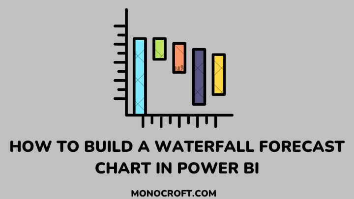
A waterfall chart is a type of chart that displays the cumulative effect of a series of positive and negative values. It is commonly used to show the changes in a company’s revenue, expenses, or profit over a specific period.
The chart starts with an initial value, which is represented as the starting point. From there, positive and negative values are added to the chart, and the chart’s height increases or decreases.
The chart’s final value is the ending point, which represents the cumulative total of the total change. The chart’s bars are usually color-coded to help distinguish between positive and negative values.
Waterfall charts are a powerful tool for displaying changes in revenue and expenses over time, and provide a clear and concise view of how different factors affect a company’s financial performance, making it easier to analyze and understand the data.
How to Create a Waterfall Forecast Report in Power BI
Creating a Waterfall Forecast Report in Power BI is a simple process. Here are the steps you need to follow:
Connect to Your Data Source
The first step is to connect to your data source in Power BI—including Excel, SQL Server, and cloud-based services like Google Analytics and Salesforce. Once you connect to the data source, you can start creating your report.
Create a Waterfall Chart
To create a Waterfall Forecast Chart in Power BI, you will start by creating a Waterfall Chart. To do this, select the Waterfall Chart option from the Visualizations pane.
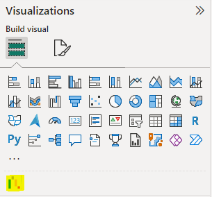
If the Waterfall chart is not included in your Power BI “Visualizations” pane, click on “…”, and select “Get more visuals”. Search for “Waterfall chart” and follow the prompt to add it to your Power BI Desktop.
Add Forecast Data
The next step is to add your forecast data to the chart. To do this, create a new series in the chart and select the Forecast option. Then enter your forecast data, including the forecast period and any other relevant details.
Add Actual Data
Once you have added your forecast data, you can now add your actual data to the chart. To do this, create a new series and select the Actual option, then enter your actual data for the same period covered by your forecast data.
How to Customize Waterfall Forecast Report in Power BI
Customizing your Waterfall Forecast Report in Power BI is essential to make it more relevant to your specific needs. Here are some tips for customizing your report:
- Choose the data fields that are most relevant to your business and display them prominently on the chart.
- Use a color scheme that matches your brand’s style and aesthetic.
- Use clear and concise labels and titles to help your audience understand the data.
- Adjust the chart’s layout to make it easier to read and analyze.
- Use annotations and notes to provide additional context and insights.
Best Practices for Using Waterfall Forecast Reports
To get the most out of your Waterfall Forecast Report, it is important to stick to best practices when creating the report. Here are a few considerations:
- Carefully select the fields of data to plot. Pay close attention to data that is most relevant to your business, such as revenue and expenses.
- Make sure the title and labels you use are easy to read and understand by the audience.
- Keep the chart simple and easy to read. Avoid cluttering the chart with too many data fields or annotations.
- Use the chart to spot financial trends in your organization. This information can help you organize resources and create plans to optimize revenue and avoid expenses.
Benefits of Using a Waterfall Forecast Report in Power BI
Now that you know what a waterfall chart is, and how to create it, let us examine some of the benefits of using a Waterfall Forecast Report in Power BI.
The Waterfall Forecast Report provides a comprehensive and dynamic view of your financial performance, which is one of its greatest benefits.
By displaying the changes in revenue and expenses over time, one can readily identify the factors affecting the financial performance of your business, which helps make critical business decisions.
Another benefit of using a Waterfall Forecast Report in Power BI is that it allows the creation of custom reports that are tailored to the specific needs of your business.
You can customize the report to display the data that is most relevant to your business, such as revenue, expenses, or profit. You can also customize the report’s color scheme, fonts, and layout to match the aesthetic of your brand.
Examples of Industries That Can Benefit from Waterfall Forecast Reports
Waterfall Forecast Reports are very useful for businesses in many different industries. Some of these industries that use Waterfall Forecast Reports include:
Retail
Retail businesses can use Waterfall Forecast Reports to analyze sales and expenses over time.
By identifying the patterns in financial performance, retailers can make informed decisions about resource allocation and develop strategies to improve sales and profitability.
Healthcare
Healthcare providers can use Waterfall Forecast Reports to analyze revenue and expenses over time. This can help identify areas of the business that need improvement. This will help develop strategies to maximize revenue and minimize expenses.
Finance
Also, financial institutions use Waterfall Forecast Reports to analyze financial performance over time.
This helps to identify trends and patterns in their revenue and expenses, which makes it easier to make decisions about how to allocate resources and develop improvement strategies.
Advanced Tips and Tricks for Using Waterfall Forecast Reports in Power BI
To take your Waterfall Forecast Reports to the next level, consider using the following advanced techniques. Here are some suggestions to get you going:
- Use custom visuals to add additional context and insights to your report.
- Use custom calculations to display the data in a more meaningful way.
- Use conditional formatting to highlight important data points.
- Use drill-through functionality to allow your audience to explore the data in more detail.
- Use Power BI’s machine learning capabilities to predict future trends in your business’s financial performance.
FAQs
What data do I need to create a Waterfall Forecast Chart in Power BI?
To create a Waterfall Forecast Chart in Power BI, you will need data that shows changes in a data series, such as revenue or expenses.
Is it easy to share my Waterfall Forecast Chart in Power BI with others?
Yes, it is easy to share your Waterfall Forecast Chart in Power BI with others by publishing it to the Power BI service and sharing it with specific individuals or groups.
Can I export my Waterfall Forecast Chart from Power BI to another application or format?
Yes, you can export your Waterfall Forecast Chart from Power BI to another application or format by using the Export feature and selecting the desired format.
Can I add animations to my Waterfall Forecast Chart in Power BI?
Yes, you can add animations to your Waterfall Forecast Chart in Power BI by using the built-in animations feature or by using custom visuals that support animations.
What are some common mistakes to avoid when creating a Waterfall Forecast Chart in Power BI?
Some common mistakes to avoid when creating a Waterfall Forecast Chart in Power BI include: using too many categories, not using consistent colors or labels, not providing enough context for the data, etc.
Conclusion: Upgrading Your Data Visualization with Waterfall Forecast Reports in Power BI
Now that you have learned how to create a Waterfall Forecast Chart in Power BI, with some tips and tricks to unlock the full potential of your data, you are ready to dive into the world of data visualization like a pro.
With your new-found knowledge, you can now create charts that provide valuable insights, as well as stunning visuals!
If you enjoyed reading this, you can also read about why your Power BI Report screen is not working and how to fix it.
Thanks for reading!