Unlock the power of data visualization with a Power BI slicer! Whether you are new to Power BI or looking to build your visualization and storytelling skills, this comprehensive guide is your ultimate resource.
Using Power BI slicers, you can filter and analyze your data to create interactive and engaging reports and visualizations.
In this article, I will walk you through what slicers are, how to create slicers, the types of slicers, and how seamlessly format them into your reports.
Let’s get started.
What is a Power BI Slicer and Why Use It?

A Power BI Slicer is a tool for filtering data and allows for interactive analysis by selecting specific values. This enhances the analysis by narrowing your focus, real-time visual updates, promoting collaboration, and saving time.
A Power BI Slicer works by allowing users to select specific values from a specified field or column in their dataset, then allows for a focus on the specified data subsets.
Furthermore, Power BI Slicers enhance the interaction and exploration of your data. Let’s go over some of the benefits of using a Power BI Slicer:
- Power BI slicers allow for interactive analysis by selecting specific values or ranges.
- Automatic update of visuals.
- It promotes collaboration by allowing multiple users to apply filters simultaneously.
- It saves time by eliminating the need for complex queries and manual filtering.
- It offers dynamic customization options for a unique experience.
Slicers in Power BI –Types
Let’s explore the common types of Power BI Slicers and their use cases:
1. List Slicer: This is a filter type that allows users to select one or more items from a list. It is perfect for categorical data with limited options, such as product categories, regions, countries, etc.
2. Dropdown Slicer: This slicer provides a dropdown menu to show available options in a field or column. This slicer is suitable for cases where you have many options and want to save some space on your report or dashboard.
3. Slider Slicer: The slider slicer lets users select values range using a slider control. It is perfect for numeric data, such as dates and percentages. With this slicer type, users can efficiently slide the control to set the desired range.
4. Date Slicer: The date slicer is particularly designed for date-based data, and allows users to select specific dates or ranges. This type of slicer is very useful for analyzing time-series data.
5. Hierarchy Slicer: The slicer is used to filter hierarchical data like an organogram, product hierarchies, etc. With a hierarchy slicer, you can expand or collapse the hierarchy levels to focus on other parts of the data.
How to Create a Slicer in Power BI
Creating a slicer in Power BI is a straightforward process. Here is a step-by-step guide on how to create a slicer in Power BI:
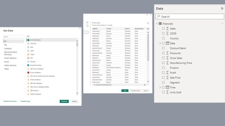
Step 1: Open Power BI Desktop and Import your Data
To start with, open your Power BI Desktop. On the “Home” tab, click on “Get Data” and pick a data source you want to import your data from – could be a local file, a database, or a cloud-based service. Select the data and import it into Power BI.
This will automatically create a data model in the “Data” pane that you can use to create visualizations and slicers.
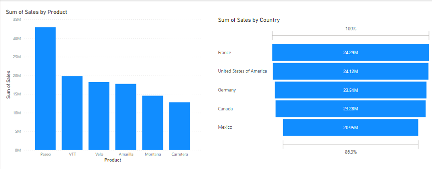
Step 2: Create a visualization
After importing your data, the next thing is to create a visualization. You can create a bar chart, line chart, table, or any other visualization that is suitable for your analysis.
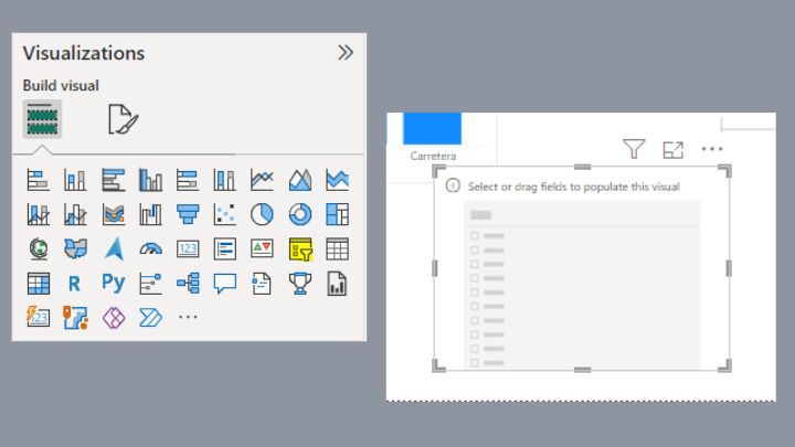
Step 3: Add a slicer
After creating a visualization, you can now add a slicer. To do that, select the “Slicer” icon in the “Visualizations” pane. This will automatically add an empty slicer to your report.
Step 6: Configure the slicer
Once you add the slicer, the next thing is to configure it by selecting the field or column you want the slicer to filter in your visualization.

Now, you can use the slicer in your visualization by selecting one or more values from the slicer to filter your data visualization.
NB: You can customize the slicer using the options available in the “Format” and “Options” panes such as changing the appearance, layout, or behavior. You can also add more slicers to give users with more filtering options.
Best Practices for Formatting Slicers in Power BI
Formatting slicers in Power BI is an important aspect of creating effective and user-friendly visualizations. Thus, there are some best practices to follow. The following are some best practices that can guide you:
1. Keep it simple: When designing slicers, ensure to always keep the design very simple. Avoid using too many colors, fonts, or effects that can distract users from the data itself.
2. Choose the right size: Always ensure to size your slicers properly to ensure they are visible enough to the audience. Very small slicers can be too difficult to read, while large ones may distract your report.
3. Align slicers properly: Make sure you align your slicers with other visualizations in your report to synergize your dashboard. This helps users understand the relationship between different components and make them better understand the report.
4. Use consistent styling: Always be consistent while styling your slicers across all reports or dashboards to create a unified and give it a professional outlook. Maintain consistent colors, fonts, and formatting options.
5. Provide clear labels: Finally, do not forget to use clear and descriptive labels in your slicers to improve the readability experience of your audience. Avoid using acronyms or abbreviations that may be confusing to users.
Troubleshooting Common Power BI Slicer Issues
Errors in Power BI Slicer can occur when multiple slicers are applied to the same report and have filter selection issues within each other which can lead to inaccurate results and inconsistencies in data analysis.
However, to troubleshoot and resolve common slicer filter errors, consider the following actions:
- Analyze slicer interactions with other visuals
- Use appropriate filtering options
- Review the slicer hierarchy and adjust dependencies
- Refresh the report and data sources
By following these practices, you can ensure that your Power BI slicers are used effectively and deliver the desired impact. Don’t forget to continuously test and refine your slicers based on user feedback and evolving data visualization needs.
Conclusion
Congratulations on completing this comprehensive guide on Power BI slicers!
Now you know how slicers can improve data analysis and visualization, and how to create engaging and interactive slicers in Power BI.
By understanding the basics and following best practices, you can now leverage Power BI slicers to filter, explore, and create interactive reports!
If you wish to learn more about slicers, you also check this article on how to ignore slicers in Power BI Measures.
Thanks for reading!