
Have you ever struggled to make sense of the data on your Power BI reports while wishing to easily identify the trends and patterns? With Power BI conditional formatting rules, you can easily color-code your insights and make them engaging.
By applying customized formatting to your visualizations based on clear rules, you can draw attention to critical data points to captivate your audience and empower your decision-making process.
In this article, I will explore how to color-code your data and create conditional formatting rules to make all the difference in your data-driven approach.
So, let’s dive right in!
Understanding Color Scales and Conditional Formatting Rules
Before we dive into the conditional formatting rules, it is important to understand the basics of color scales and rules.
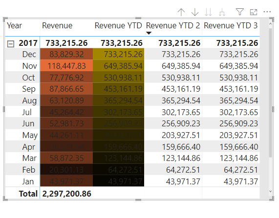
To start with, color scales are a visual representation of data, where each data point is given a color based on its value to help identify trends and patterns. In Power BI, you can set up color scales using various methods, e.g., gradient scales, percentile ranks, etc.
Conditional formatting rules, on the other hand, customize visuals based on certain criteria. For example, you can set up a rule to highlight cells with a value above a certain threshold or to change the font color of specific cells based on their value.
By applying conditional formatting rules to your visuals, you can easily draw the attention of your audience to important data points, which could aid to make informed decisions.
Types of Formatting Rules — Background Color, Font Color, Data Bars, and Icons
There are various conditional formatting rules. With each having its own benefits, you can choose the type that best suits your needs. The most common types include:
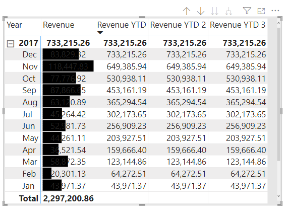
Background Color
Basically, the Background and Font color are two identical options that affect the background color and font color of the cell, respectively.
They can both be conditionally formatted, and they can be the same or different. If you make the font and background of a field the same color, the font will blend into the background, leaving only the hues in the table column.
Data Bars
Data bars allow you to apply a horizontal bar to each value in a table or matrix. The length of the bar is proportional to the value of the data.
This makes it easy to quickly identify the largest and smallest values in a table.
Icons
Icons allow you to replace the values in a visual with icons based on the value of the data.
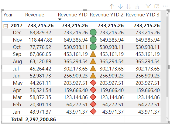
For example, you can replace the values in a table with traffic lights to indicate the status of a project.
How to Create Conditional Formatting Rules in Power BI
Now that you understand conditional formatting and the types, let us explore how to create conditional formatting rules in Power BI.
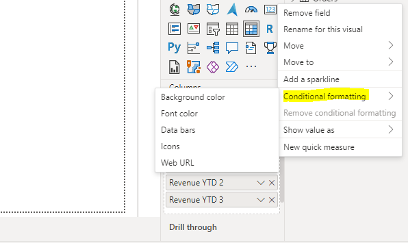
To start with, open your Power BI report and select the visual you want to apply conditional formatting. In the “Visualizations” pane, go to the “Values” section, right-click any of the values you want to format, then select “Conditional Formatting.”
Here, you can choose the type of formatting you want to apply (e.g. background color, font color, Icon, etc.).
After selecting the type of formatting you want to apply, Power BI will display a new window where you will set the conditions for the formatting. To do this, you can select a pre-defined rule, or create a custom rule based on your specific needs.
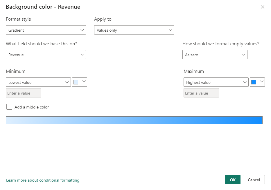
You can then customize the formatting options to your liking, and choose the color scale, the minimum and maximum values, and other formatting options. Then you can save this by clicking “OK” and apply them to other visuals or reports as needed.
Advanced Conditional Formatting — Using Custom Expressions
Power BI also allows you to create custom expressions for conditional formatting. This gives you more control over the formatting and allows you to apply more complex rules to your data.
To create a custom expression for conditional formatting, select the visual you want to apply the custom expression, then click on the Format button in the Visualizations pane. Here, select the Data Colors option, and choose the Advanced Controls option.
Then select the field that you want to apply the custom expression to, and enter the custom expression in the Expression box. You can then preview the visual to see how the custom expression looks, then save it.
Common Mistakes to Avoid when Using Conditional Formatting in Power BI
While conditional formatting can be a powerful tool, there are common mistakes you should avoid for effective data analysis and visualizations. They include:
Overusing Colors
It is important to keep things simple when it comes to color-coding your insights. So, avoid using too many colors or formatting options, as this can make your visuals confusing and hard to read.
Ignoring Context
When setting up conditional formatting rules, it is also crucial to consider the context of your data. For example, a value that is high in one context may be low in another context. So, ensure your conditional formatting rules consider your data context.
Using Inaccurate Data
Finally, make sure your data is accurate and up-to-date. Using inaccurate data can lead to incorrect conclusions and decisions, which can have effects on your data.
Other mistakes to avoid include:
- Using inconsistent formatting across different visuals
- Not testing different formatting options to find the best one for the data
- Using formatting to distract or confuse the viewer, rather than to highlight important data points and trends
Using Conditional Formatting for Data Analysis and Insights
Conditional formatting helps with data analysis and insights to highlight key data points and trends. For example, you can use conditional formatting to identify:
- sales trends based on product type or region
- employee performance based on sales or productivity metrics
- website traffic patterns based on the time of day or day of the week
- customer behavior patterns based on demographics or purchase history, etc.
FAQS: How to Create Conditional Formatting Rules in Power BI
Is it possible to copy and apply conditional formatting rules to visuals in Power BI?
Yes, Power BI allows you to copy conditional formatting rules from one visual to another. This saves time and maintains consistency across your visuals.
Does Power BI support conditional formatting for all visuals?
While most Power BI visuals, such as bar charts, line charts, tables, etc., support conditional formatting, some visuals have formatting restrictions.
How to remove or disable conditional formatting rules in Power BI?
To remove or disable conditional formatting rules in Power BI, right-click the value in the Visualizations pane. and select “Remove conditional formatting.” Alternatively, you can simply use “Ctrl + Z” to undo it.
Are conditional formatting rules in Power BI responsive to data changes?
Yes, conditional formatting rules in Power BI are dynamic and responsive to data changes. This ensures that your visuals adjust and update based on the latest data.
Conclusion
Conditional formatting is a powerful tool that can help you quickly identify key insights and trends in your data.
You may create interesting and engaging reports by color-coding your findings, and can make all the difference in your data-driven strategy!
So, start experimenting with color scales and rules today, and see how you can take your Power BI reports to the next level.
If you enjoyed reading this, you can also check out how to create Power BI Matrix with color coding.
Thanks for reading!